By Kristen Ribero
VP of Marketing at unitQ

Most teams collect more feedback than they can realistically process. App reviews pile up, support tickets sit in queues, and NPS responses get exported to spreadsheets nobody opens again. The feedback exists, but the insights don't.
That's why we built free customer feedback analysis templates for Google Sheets and Notion, based on the taxonomy and methodology behind our 2026 Benchmark Report, an analysis of 67.7 million app reviews.
The problem isn't effort. Forrester's 2025 CX Index found that US customer experience quality has declined for four consecutive years and sits at an all-time low, with only 7% of brands improving. Teams are collecting more feedback than ever while satisfaction keeps falling. What's missing is a structure for making sense of it all.
Customer feedback arrives from everywhere: app stores, support tickets, NPS surveys, social media, sales calls, community forums. Each channel uses different formats, different language, and different levels of detail.
Without a consistent framework, teams run into three problems.
First, inconsistent categorization. One person tags an issue as "bug," another calls it "performance," and a third files it under "UX." The same problem shows up three different ways in your data, and the pattern disappears.
Second, no clear prioritization. When everything feels urgent, nothing gets prioritized, and teams react to the loudest complaints instead of the most impactful issues.
Third, no connection to outcomes. Feedback lives in one system, product decisions happen in another, and there's no clear link between what customers say and what ships.
These aren't technology problems. They're structure problems. And structure is exactly what a good template provides.
Both templates are built around a single, focused feedback log. Every piece of feedback gets one row with twelve fields: date, source, customer segment, the feedback itself, category, type, sentiment, impact, status, owner, action taken, and date resolved. A field guide sits alongside the log so everyone on your team tags feedback the same way.
A taxonomy built on real data. The category structure comes from our analysis of 67.7 million app reviews. These are the categories that actually appear in feedback at scale — Bug, Performance, Feature, Support, Billing, Onboarding, and Security — each with defined options for source, segment, type, and sentiment so your data stays consistent from day one. You can read more about this approach in our guide to feedback intelligence.
Impact scoring that stays simple. Each item gets an impact rating from 1 (low) to 5 (critical) alongside its sentiment. Sort by impact, filter to negative, and your priorities surface in two clicks. There are no formulas to break and nothing to configure — we kept it deliberately simple so your team spends its time on the feedback, not the spreadsheet.
A benchmark built in. The most useful finding from our research sits at the top of the template: users complain about broken basics six times more often than they request new features. If your own ratio looks dramatically different, you're either sitting on an unusually happy user base or you're under-capturing complaints. It's the same pattern we found across the 2026 Epic Awards winners — the best apps fix friction faster than they add features.
Questions to ask your data. The template closes with six prompts to run against your log, from your complaint-to-feature-request ratio to how many high-impact items are still open. They're designed to turn a list of rows into a point of view.
Pick the format that matches how your team works — the taxonomy and scoring are identical in both.
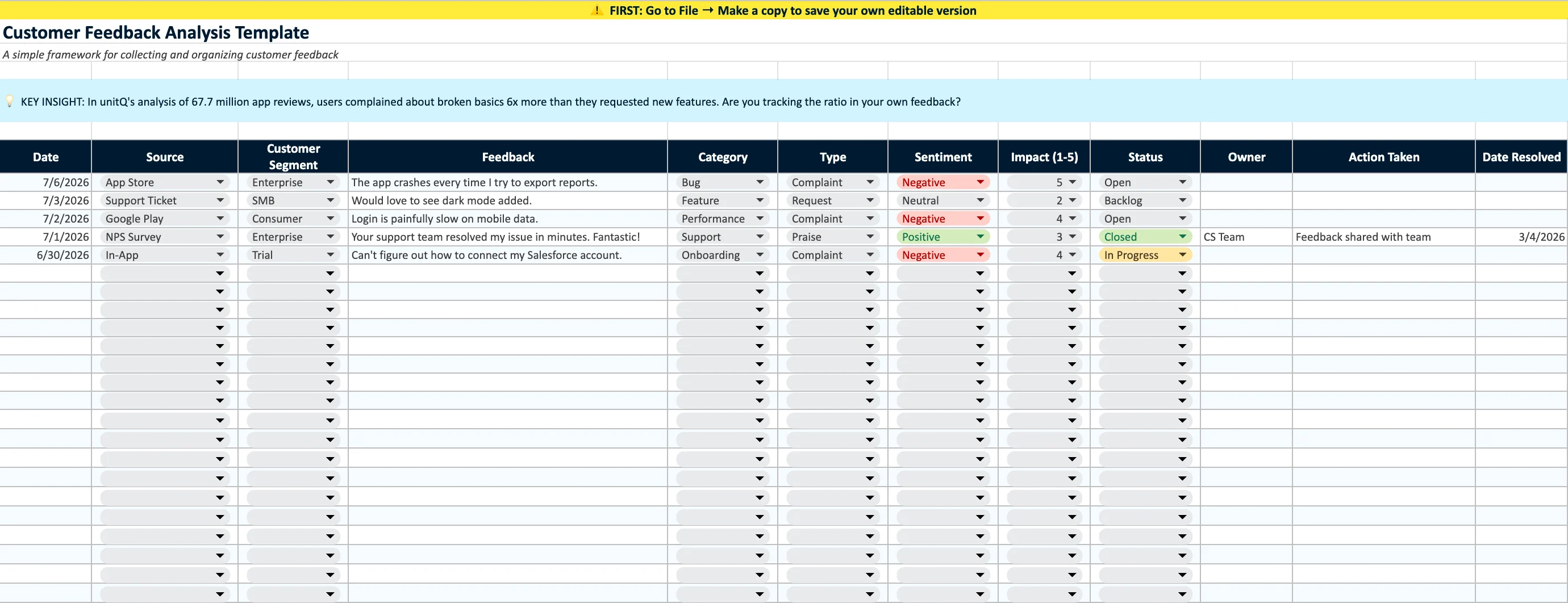
Best for calculations, sorting, and quantitative analysis.
For Google Sheets:
Download the template via the link below
Upload to your Google Drive, then open the file
Go to File → Save as Google Sheets
Start logging feedback — sample rows show you the format
Get the Sheets and Excel template →
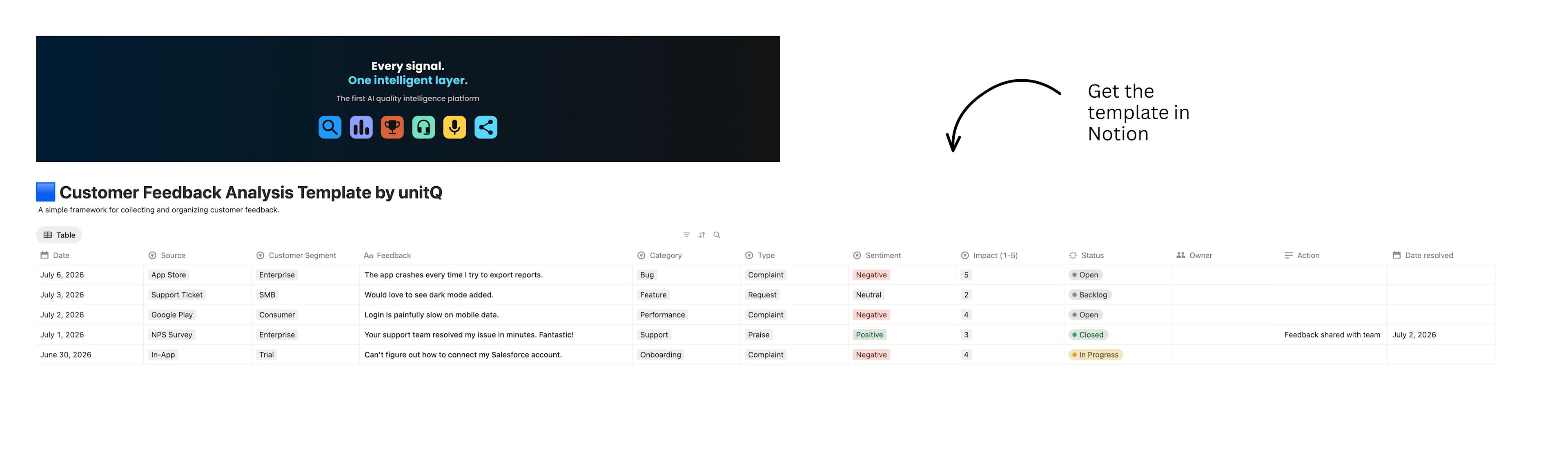
Best for managing feedback as an ongoing workflow, with a drag-and-drop triage board, a high-priority view, and a built-in weekly review.
Open the template from the link below
Click Duplicate in the top-right corner
Choose your workspace
Start logging feedback in the database
Your data stays private. unitQ doesn't have access to your copy.
A template is only useful if it changes decisions. Three ways to connect it to outcomes:
1. Run a weekly review. Block 30 minutes each week, filter to impact 4–5 with negative sentiment, and work down the list. These items deserve attention before anything else in the backlog.
2. Track your ratio over time. The type column makes complaints and requests countable, so you can watch your own ratio against the 6:1 benchmark week over week. A rising complaint share tells you core issues are accumulating faster than you're resolving them.
3. Connect feedback to releases. When you ship a fix, log it in the action-taken column with a resolved date. Over time you build a record of what you've addressed — useful for quarterly planning, and for showing stakeholders that feedback goes somewhere.
monitorQ does the same analysis automatically, categorizing feedback from every channel in real time and flagging the issues that matter before they escalate.

We built unitQ to help product teams understand what users actually experience. Our platform analyzes feedback at scale with AI, surfaces emerging issues, and connects insights to quality metrics — you can see how that compares to manual approaches in our guide to choosing customer feedback tools.
But not every team is ready for a platform. Sometimes you need a spreadsheet or a shared workspace that works. This template reflects the methodology we use with our customers — the taxonomy, the tagging logic, the benchmark — and we're sharing it because better feedback analysis leads to better products, whatever tools you use.
If you outgrow the spreadsheet, that's a good sign. Take a look at the 2026 Benchmark Report to see what this analysis looks like at the scale of 67.7 million reviews, or explore how AI customer sentiment analysis automates the categorization you're doing by hand.
Get the Sheets and Excel template →
Join product and CX leaders getting the latest on customer intelligence, once a month.