What makes a great app? Five patterns behind the 2026 Epic Awards winners
Jun 04, 2026By Kristen Ribero

On paper, the 2026 Epic Awards winners don't belong together. One's a drag-racing game. One's a bank. One teaches languages during the morning commute. And one helps you find love.
Different users, different moments, different definitions of what success looks like. On paper, they share nothing.
So what makes a great app in 2026? This year’s winners answer it for us: no panel picked them and no one was nominated. Users determined them, surfaced from a unitQ analysis of 83 million public app store reviews across 6,700+ apps in 2025.
Look past the categories at how each product behaves, and the same few patterns keep surfacing. This post is about those patterns: five things great apps share, and what any team can take from them.
Pattern 1: Great apps prove their worth before they ask for anything
Most apps still open with a toll booth. Create an account, verify your email, maybe hand over a card, and then, finally, you see what you came for. The 2026 winners flip that order. They hand you the core experience first and ask for commitment once you feel its value.
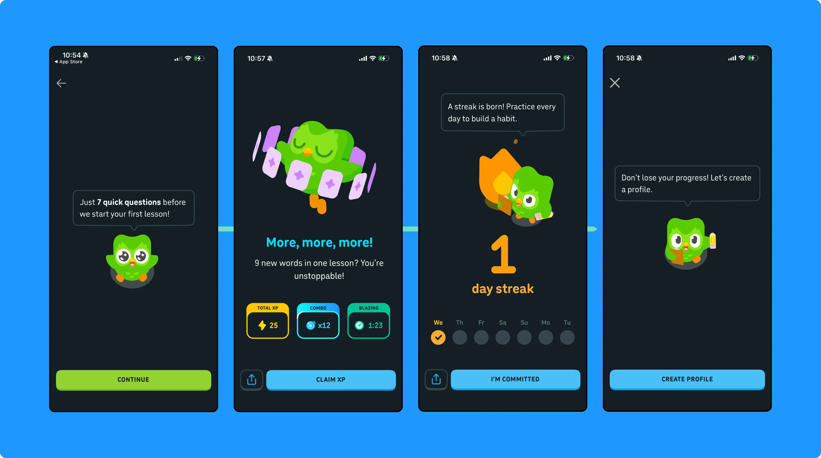
Duolingo drops new users straight into a lesson, and the signup prompt waits until after that first win — the moment saving your progress actually matters. Onboarding teardowns point to this inversion — value first, account second — as one of Duolingo's highest-impact retention changes. Deferring that prompt until after the first lesson turns account creation from a barrier into a natural next step.
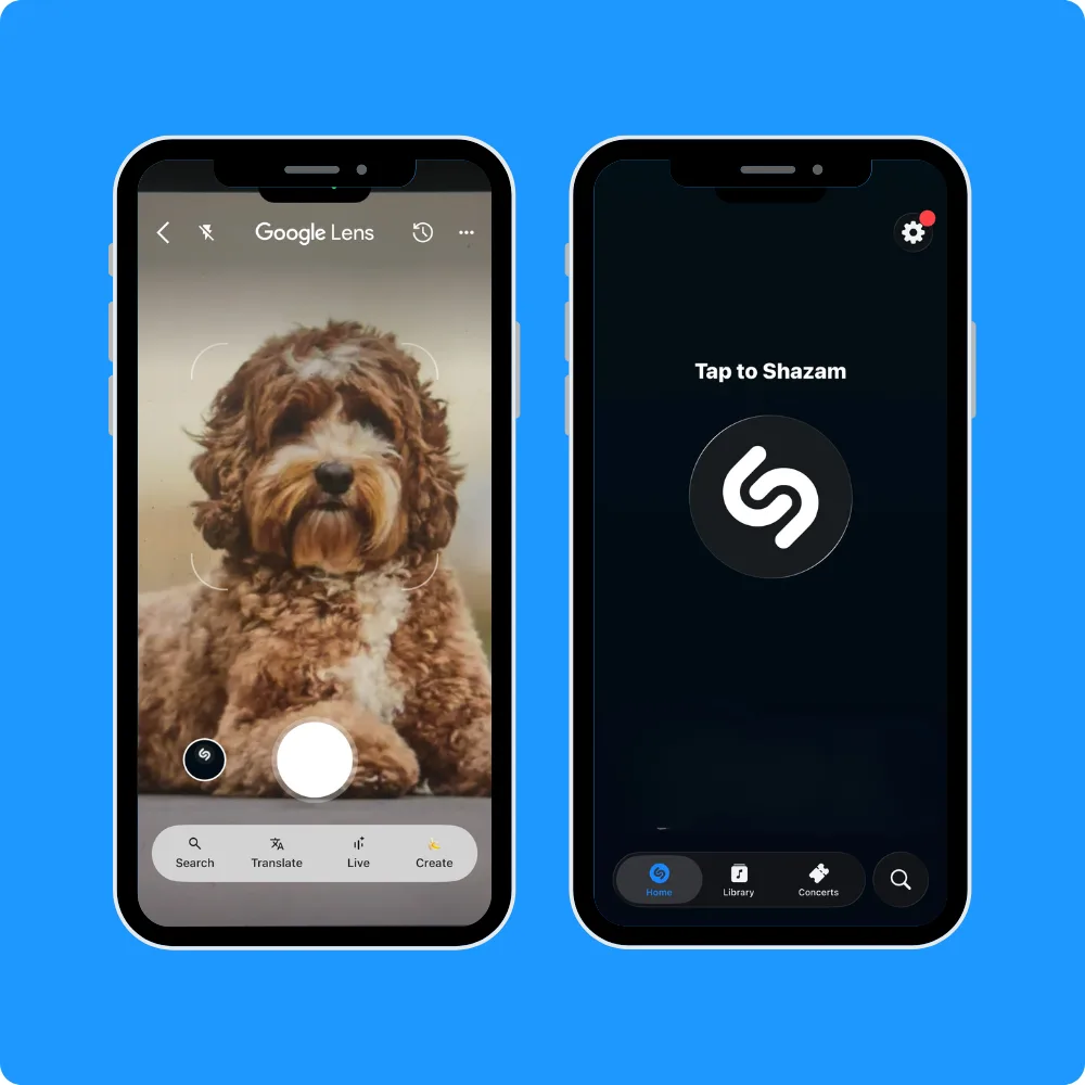
The same instinct runs across categories. Google Lens skips configuration entirely. Point the camera, get an answer. Shazam offers a single button that starts listening the second you open it, no profile required.
The pattern isn't "no onboarding." It's sequencing. Deliver value before you ask for effort. Each of these drops the cost of the first session to almost nothing, so a user's first impression is the product working, not a form to fill out.
Great apps earn the signup. They don't demand it.
Pattern 2: The best teams treat feedback as a live roadmap
Plenty of companies collect feedback. The winners do something rarer — they act on it, then tell users they did. Closing that loop is what turns a one-star review into a second chance.
Canva builds this into how it operates. The design platform serves 260 million monthly users, and it treats "closing the loop" as a company-wide discipline. Listen to what users report, fix it, then go back and tell them what you fixed. In 2024 alone, Canva closed one million loops, resolved one million issues, and sent one million messages to users about that change. At that scale, telling users they were heard does real work. It's a big part of why they stay.
Duolingo exemplifies the other half of that loop — acting fast and at volume. The popular language learning app runs an experimentation engine that tests hundreds of ideas at once and allows user behavior to decide on what ships. When the team rolled out a new pacing system called Energy, they noted a lift in daily active users, time spent on the app, and subscriber conversion. The actual feature matters less than the lesson on where it came from — a decision driven by what users actually did, not a roadmap locked in a year earlier.
The contrast with most products is stark. The average team gathers feedback in a quarterly survey, files it, and revisits it months later, by which point the user who complained has already churned. The 2026 Epic Award winners compress that cycle. That's the move the winners share — read the signal continuously, route it to the team that can act, and respond while users still care.
This is where unitQ's view of product quality sits — the truest measure of a product is what users say about it, and the best teams build feedback loops that let them hear and act in real time. The winners don't treat that as a support nicety. They treat it as how the product gets better.
Hear users, act, and close the loop. That's the line between a product people tolerate and one they trust.
Pattern 3: The best apps make waiting feel like progress
Speed is partly real and partly perceived. The winners are exceptionally good at perception when it comes to managing how time feels, so a wait reads as progress, not dead air.
Uber built a discipline around it. On their blog, Uber describes designing wait-time screens around behavioral science, idleness aversion, operational transparency, and the goal gradient effect — surfacing each step as it happens (e.g., matching riders, finding a car) so the user feels forward motion. That moving car on the map does more than inform; it makes three minutes feel like one.
Domino's turned the same idea into an icon. Their infamous Pizza Tracker, which has followed more than 2.5 billion orders since 2008, shows each stage of the pizza journey from prep to delivery. Domino's was already tracking orders internally, so they simply opened a window into the data they had. Researchers call this operational transparency. Letting people see the work makes them value the result more and perceive the wait as shorter.
The same instinct shows up in microseconds, not just minutes. The best apps acknowledge every tap right away, a state change, an animation, a confirmation, even while the real work runs in the background. UX designers have a name for the ceiling: the Doherty Threshold, roughly 400 milliseconds, past which a system starts to feel sluggish and attention drifts. It's the standard great apps design toward, so a tap always produces an instant reaction.
What connects a four-minute pizza stage and a 200-millisecond screen transition is a refusal to leave users guessing. Uncertainty is what makes waiting feel long, and the winners design it out.
Make the wait visible, and it stops feeling like waiting.
Pattern 4: Great apps remove friction faster than they add features
There's a quiet bias in most product orgs toward building features that are novel. New features demo well, and they're easier to celebrate than a deleted step. The 2026 Epic Award winners resist that pull. They spend a disproportionate share of effort smoothing out what already exists.
The data confirms this. unitQ's 2026 Benchmark Report found that users complain about friction and broken experiences roughly six times more often than they ask for new features. Most teams hear the feature requests and miss the friction. The winners do the reverse.
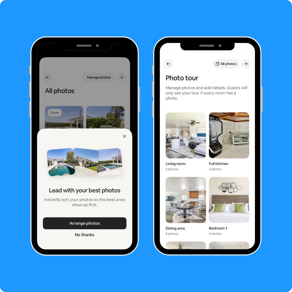
Airbnb, for example, went after an old annoyance —‚ messy, disorganized listing photos — instead of bolting on another host tool. So their team fine-tuned vision transformer models to automatically sort listing images into room types, turning a tedious manual chore into something that can now happen on its own. That's value created by subtraction, not addition.
Wise built an entire company on the same foundation. International wire transfers were historically slow and riddled with hidden exchange-rate markups, so they made their promise the mid-market rate — the real exchange rate banks mark up — and one clear, upfront fee. Seventy-four percent of transfers now arrive in under 20 seconds. Its appeal is subtractive. It strips out the opacity, the markups, and the wait that bank transfers had trained everyone to accept.
Removing friction is invisible work. Nobody writes a press release about a form field that disappeared. But it's the work users feel most, because it's the line between an app that respects their time and one that wastes it.
The winners would rather delete a step than ship a feature. Their users can tell.
Pattern 5: Trust is a feature users can feel
In categories where the stakes are personal — your messages, your browsing, your money — the 2026 Epic Award winners treat trust as part of the product, not a policy buried in settings. And users reward it, sometimes dramatically.
Signal’s entire value proposition is privacy — end-to-end encryption, minimal metadata, and a not-for-profit structure rather than a business built on monetizing user data. That positioning turns trust into growth. Every time a competitor stumbles on privacy, users move. Signal became the most downloaded free app in the Netherlands in early 2025, with downloads rising roughly 958% from December to February as data-privacy worries spread across Europe.
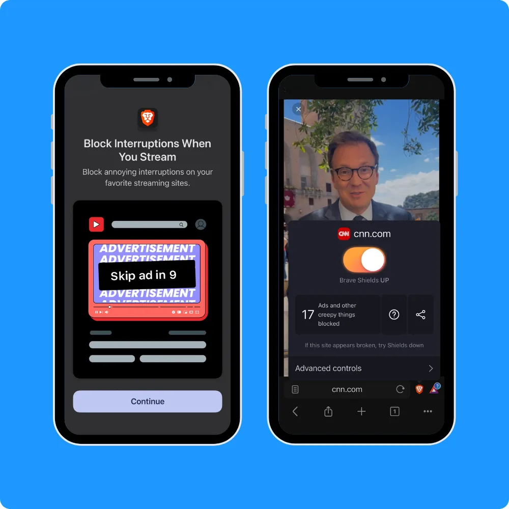
Brave makes the same bet in the browser. It blocks ads and trackers by default, so protection is on the moment you start browsing, no configuration, no opt-in. For its users, that default is the whole point; many switched precisely because the privacy comes standard.
The pattern holds across high-trust categories. Fintech winners earn loyalty by being transparent about fees and showing money move in real time; dating apps lean on verification and safety tools so users feel comfortable showing up as themselves. Trust isn't communicated in a privacy policy. It's built into how the product behaves the first time you open it.
That's the shift worth noticing. Trust used to be a brand promise, something asserted in marketing. For the winners, it's a design and engineering decision the user feels directly, before reading a word about it.
Win a user's trust inside the product, and you rarely have to ask for it.
The through-line
Strip away the categories and the five patterns collapse into one.
Every one of them is a way of listening.
Value-first onboarding pays attention to where users lose patience.
Closing the loop answers what they report.
Perceived speed addresses the anxiety of waiting.
Friction removal targets what frustrates them.
And trust speaks to what they're afraid of.
None of these patterns begins with a roadmap; each begins with paying attention to users, then acting fast enough to matter.
That's unitQ's view of product quality in a sentence: users are the truest measure of whether a product is good, and the best teams build feedback loops to hear and act in real time. Great products are never finished — they're tuned continuously by teams who treat what users say as the signal that runs the company. That's what makes a great app: they listen, and they act before a user has to ask twice.
Where does your product stand?
Get your free unitQ Score.

Epic Awards Methodology
The inaugural Epic Award winners were identified algorithmically, ranked by the unitQ Score, a measure of how many users report a seamless experience, drawn entirely from public app store reviews. The methodology analyzed 83 million reviews across 6,700+ apps from the full 2025 calendar year, then recognized the top products in each of six categories: AI & Productivity; Gaming; Fintech & Payments; Marketplace & On-Demand; Media, Health & Consumer; and Social & Dating. No nominations, no judges, no fees. Just what users said, at scale.